The short version about this…

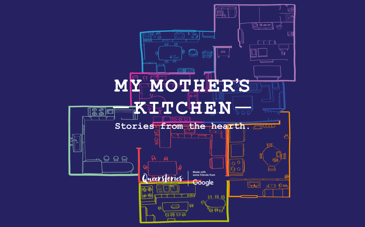
My Mother's Kitchen shares stories from the hearth. Centred around their childhood kitchens, listen as 8 LGBTIQ+ storytellers relay intimate memories of joy and comfort mixed with inequality and hardship.
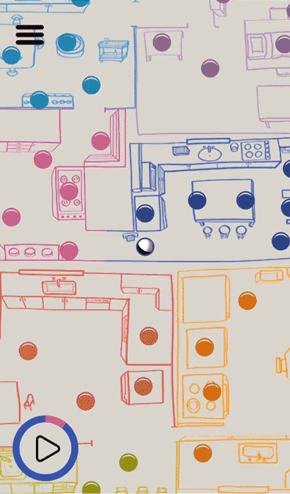
The experience strikes a balance between playful; in its UX design and storyteller humour, and serious; in its exploration of under-represented stories that discuss upbringing, self discovery and identity. It’s an immersive audio visual experience: a bit like a game of mini golf on a mobile phone, with a tiny podcast at each hole!

You might have seen it exhibited at…
Queerstories, 2019 (Australia)
The Sheffield Doc/Fest, 2019 (United Kingdom)
Brighton Digital Festival, 2019 (United Kingdom)
All About Women @ The Sydney Opera House, 2020 (Australia)

The longer version & my role in this…
This was a project created while I was a Fiver/designer in the Google Creative Lab, that started with something along the lines of “let’s do something with audio” from Tea Uglow. It was a collaboration within the Lab – Kirstin Sillitoe (team lead), Haylie Craig (art director), Samantha Cordingley (producer), Jude Osborn (developer), and externally with Olivia Rosenman (audio producer) and Maeve Marsden + storytellers from Queerstories.
My role was to design something fun with audio – how it functioned and looked.
How do you design for the unknown?
Things yet to define:
What is it – a web experience, mobile experience, event, interactive exhibition?
What’s the content? What is the audio about?
Who is it for?
Where and how would it be disseminated?
How do you make audio fun?
How do you interact with something you can’t see?
What would it look like without deciding on the content?
The biggest challenge was to somehow design based on nothing more than there being some form of audio. There were multiple experiments of trial-and-errors, simultaneously, with the subject matter, how it worked (UX), and how it looked (UI). The possibilities were endless. Everything was designed with placeholders until the final content was produced.
The process was a non-linear form of designing; piecing together a puzzle without knowing what the end result would be.
Some experiments along the way…
Maps, audio players, menus, navigation, interaction, holes, balls, colours, typefaces, movement


Basic wireframe

Designed Screens

Overview of core and advanced features
Countless meetings & hundreds of slides later…
It was decided that it will be women talking about their childhood kitchens, which later changed to LGBTIQ+ storytellers when partnered with Queerstories.
The basic framework:
Stories on childhood kitchens
Interact by tilting your phone to roll around
Listen to audio by falling into an ‘audio hole’
Kitchens will be illustrated by the storyteller
Other issues encountered
Physics of ball movement
What’s the starting position of the phone?
Would people naturally hold it flat or tilted?
How would gravity work in this space?
Should the ball be ‘sucked’ into the holes?
How do you get out of the holes?
Is the ball moving or the background?

Making assumptions
It hadn’t occurred to us that the storytellers’ illustrations may not be consistent with one another, despite providing the same materials for each person. I took the agency of redrawing them based on their original maps and information from the audio.

Redrawn and connected maps. Thicker lines indicating restraints on ball movement – where it would bounce off of.
Some more things happened,
then the audio-visual immersive experience was created.
Dissemination: How it’s exhibited
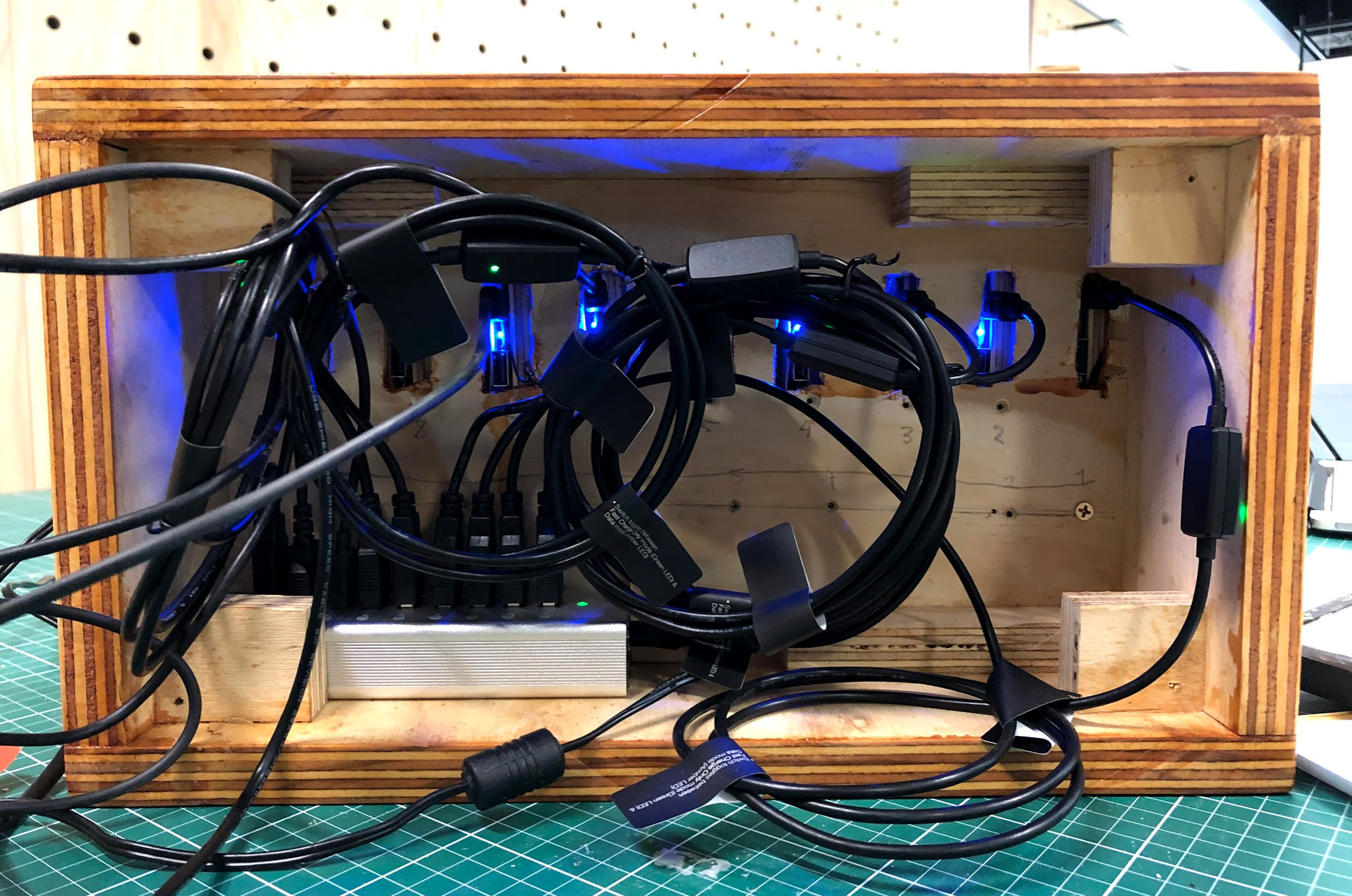
The phone cases were custom-made 3D printed to look like a book. Then fitted in a bookshelf with wireless chargers. These were executed by other members of the team.

3D printed phone case
Back of bookshelf

Wireless charger
Designing the ‘book covers’

How do you make a phone look like a book?
Problem: the cases need to be used for other books, so, no gluing directly onto the case.
Solution: make a die-cut to wrap the paper around each notch. The tabs used to hold it together will be scanned pages of real books to create a convincing texture.
Other solutions:
Cutting the front (pictured below) so that the phone can hold down the edges without it ripping from users handling it.
Leaving a hole on the side for the power button but still covering it with page textures.
Creating a new button made of paper for easy access without using nails.
Tapering folding tabs in 2 parts to minimise extra paper potentially sticking out while covering every edge.


